AngularJS: Export Json object to Excel using AlaSQL


Hello,

I have spent significant time developing AngularJS and Angular 2 applications. But this requirement is quite new to me. Well, user wants to export to excel feature on one of our application page where we are using filtered data based upon some parameters. The design decision was on me whether to choose server side function to convert Json object in to CSV format and then export it to excel.

But I decided to choose another approach, not to involve server in exporting a Json data. I was not aware about ALASQL but later explored and found its very useful for me to implement this solution. Here I am explaining how to implement it.

What you need to import :

Just an intro about these two libraries:

AlaSQL is an open source SQL database for Javascript with a strong focus on query speed and data source flexibility for both relational data and schemaless data. It works in your browser, Node.js, and Cordova.

This library is designed for:

  • Fast in-memory SQL data processing for BI and ERP applications on fat clients
  • Easy ETL and options for persistency by data import / manipulation / export of several formats
  • All major browsers, Node.js, and mobile applications

Where js-xlsx is used to support for AngularJS export library. Both of these two has support to NG2 you can find more details about it here.

There are two ways to achieve the export:

  1. From Json object
    • alasql(‘SELECT * INTO XLS(“test.xls”,?) FROM ?’,[customStyle,$scope.items]);
  2. From html(like table)
    • alasql(‘SELECT * INTO XLSX(“myinquires.xlsx”,{headers:true})  FROM HTML(“#HtmltagID”,{headers:true})’);

It is very easy to implement. Please refer to my plnkr code to see the examples.

http://plnkr.co/edit/2UKA8yPl9Uiarr2uSwEd?p=preview

Hope this blog is beneficial for you.
 

AngularJS: Bind UI Select selection sequentially


Hello,

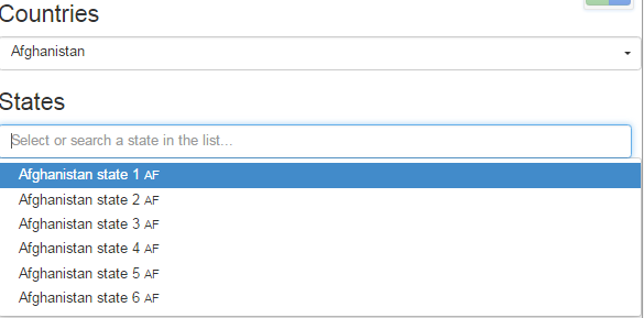
I felt lucky to work with angularJS with the integration with SharePoint(as backend) in my recent project. There was a requirement to have two drop-downs on a single page application where on selection of one; other drop-down value will be automatically filtered.  I am going to share with you guys that how I have implemented.  I understand that this may not be Ideal way of doing it but I am sure that it is quickest solution that I did in code to achieve this requirement.

HTML: The below html will generate two dropdowns and populate with country and states data.

<h3>Countries</h3>
<ui-select ng-model="ctrl.country.selected" name="country" theme="bootstrap" title="Select a Country" >
<ui-select-match placeholder="Select or search a country in the list...">{{$select.selected.name}}</ui-select-match>
<ui-select-choices repeat="country in ctrl.countries | filter: $select.search">
<span ng-bind-html="country.name | highlight: $select.search"></span>
<small ng-bind-html="country.code | highlight: $select.search"></small>
</ui-select-choices>
</ui-select>
<h3>States</h3>
<ui-select ng-model="ctrl.state.selected" name="state" theme="bootstrap" title="Select a state">
<ui-select-match placeholder="Select or search a state in the list...">{{$select.selected.name}}</ui-select-match>
<ui-select-choices repeat="s in ctrl.states | countryFilter: { concode: ctrl.country.selected.code }">
<span ng-bind-html="s.name | highlight: $select.search"></span>
<small ng-bind-html="s.concode | highlight: $select.search"></small>
</ui-select-choices>
<ui-select-no-choice>
<span ng-if="ctrl.country.selected.name">&nbsp; No state found for '{{ctrl.country.selected.name}}' country !</span>
<span ng-if="!ctrl.country.selected.name">&nbsp; Please select country !</span>
</ui-select-no-choice>
</ui-select>

Custom Filter:

If you have notice in abouve html code, I have created a custom search filter which search the states dropdown data based on the countyr selected using first dropdown. Here is the code for the filter:

app.filter("countryFilter", function () {
return function (items, props) {
var out = [];
if (angular.isArray(items)) {
var keys = Object.keys(props);
items.forEach(function (item) {
var itemMatches = false;
for (var i = 0; i < keys.length; i++) {
var prop = keys[i];
var text = props[prop].toLowerCase();
//if (item[prop].toString().toLowerCase().indexOf(text) !== -1) {
if (item[prop].toString().toLowerCase() === text) {
itemMatches = true;
break;
}
}
if (itemMatches) {
out.push(item);
}
});
} else {
// Let the output be the input untouched
out = items;
}
return out;
};
});

Demo: Plunker Demo

Output:

untitled

Hope this post will help you creating synchronous drop down using UI-Select.

Happy Coding !!

CSS Trick: Create tag icon with dynamic text width using Pure CSS


Hi Guys,

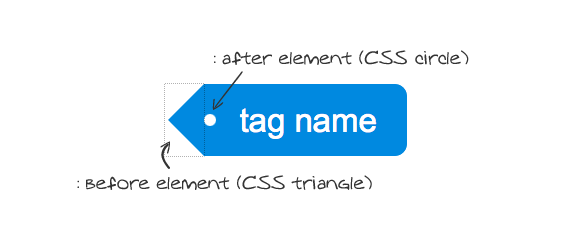
If you are searching for a tag icon which can be used to show few keywords on any page. Then this is the place where you can find a very simple trick to generate it with in few minutes. The icon created using this CSS trick has feature that it can take dynamic width based upon the text width. Below image is the example how it will rendered:


Tag Icon


Click here for the Demo.

Basics:

Pure CSS post tags uses at least 2 CSS tricks such as CSS triangles and CSS circles. For CSS triangles you need to manipulate borders of an element that has zero height and width. CSS circle is simpler. All you need is a square element with rounded corners set to at least half the size of the element. The border radius will then merge into a circle.

scheme

HTML

I usually markup tags with unordered list. So the markup is fairly simple:

<ul class="tags">
   <li>CSS</li>
   <li>HTML</li>
   <li>Mohit</li>
   <li>Vashishtha</li>
   <li>SharePoint</li>
 </ul>

In the CSS part :before and :after pseudo elements will do the rest of the trick and style them to achieve the styling look like a tag.

CSS

I am placing the tags list at the bottom of the post element with adjusting ULs absolute position

.tags{
	margin:0;
	padding:0;
	position:absolute;
	right:24px;
	bottom:-12px;
	list-style:none;
}

Height (and line-height) of the list item LI. Also few margins and padding and some rounded corners on the right hand side.

.tags li{
	float: left;
        height: 24px;
        line-height: 24px;
        position: relative;
        font-size: 11px;
        margin: 2px 5px 2px 12px;
        padding: 0 10px 0 12px;
        background: #0078d7;
        color: #fff;
        text-decoration: none;
        -moz-border-radius-bottomright: 4px;
        -webkit-border-bottom-right-radius: 4px;
        border-bottom-right-radius: 4px;
        -moz-border-radius-topright: 4px;
        -webkit-border-top-right-radius: 4px;
        border-top-right-radius: 4px;
}

To achieve the pointed edge we are adding a :before pseudo-element. The element has the width and height set to zero, that way we are only using it’s borders. To “draw” an arrow pointing left we are showing only the right border.

.tags li:before {
 content: "";
 float: left;
 position: absolute;
 top: 0;
 left: -12px;
 width: 0;
 height: 0;
 border-color: transparent #0078d7 transparent transparent;
 border-style: solid;
 border-width: 12px 12px 12px 0;
}

The last element to add is the :after pseudo-element. This will act as that rounded hole. What we’re doing here is creating an empty square, and we’re rounding it’s edges so we create a circle (and of course we position it with position: absolute).

.tags li:after {
 content: "";
 position: absolute;
 top: 10px;
 left: 0;
 float: left;
 width: 4px;
 height: 4px;
 -moz-border-radius: 2px;
 -webkit-border-radius: 2px;
 border-radius: 2px;
 background: #fff;
 -moz-box-shadow: -1px -1px 2px #004977;
 -webkit-box-shadow: -1px -1px 2px #004977;
 box-shadow: -1px -1px 2px #004977;
}

That was a basic html and CSS code but if someone want to make this tag as clickable then It can easily be achieved by adding anchor tag inside the LI element. Also need to add some classes to handle the hover of achor tag.

I hope this blog is helpful for you.

Happy Designing 🙂 !!